Improving the Command Line - Better Visual Feedback
Posted on 21 October 2017 in T31LoSB
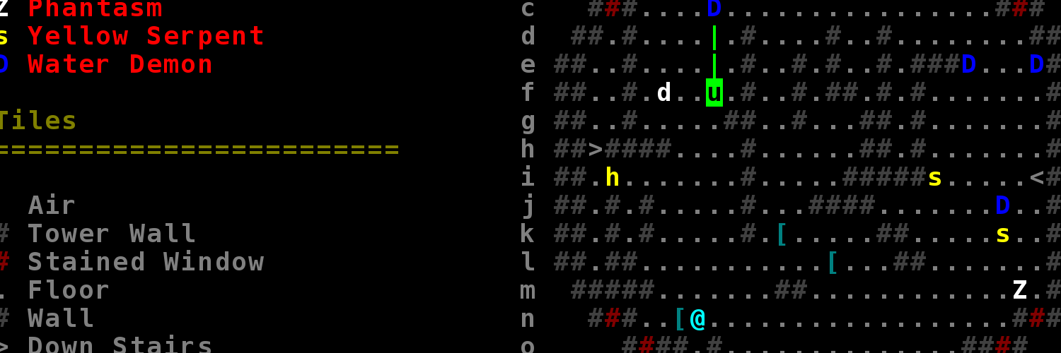
The command line auto complete has an issue. For reference on the right is what a user typed, and on the left is what the game thinks the user means.

Unless one is paying close attention, one might not notice the game interpreting small typos wrong (or against what one would expect anyway). This week I tried to improve the visual feedback and make it clearer what command the user is actually about to run, adding new color distinction to the auto complete.

What the user actually typed is highlighted in bright blue, and what the auto complete infers is tacked on in dark teal. If no command can exactly match what the user typed, the auto complete will show its best guess in yellow. Likewise, perfect matches are shown in green.
Orbiting the Sun-Earth L2 Lagrange Point
Just a project site for some of my hobby coding projects
Projects on This Site
Project Posts
- Re-Balancing Bolt Attacks
- Dynamically Resizable Game Window - Part 2
- Dynamically Resizable Game Window
- New Year, New User Interface - Part Three
- New Year, New User Interface - Part Two
- New Year, New User Interface
- OSX 'Enter' Bug Fix
- Adding a Tactics Puzzle Mode - Part Three
- Speeding Up Combat
- Map Generation and Character Balance
- Save Games
- Adding a Tactics Puzzle Mode - Part Two
- Adding a Tactics Puzzle Mode
- Refactoring the UI Into an MVC Architecture
- Improving the Command Line - Better Visual Feedback
- Project Launch - The Thirty One Lieutenants of Sorcerer Bedsui